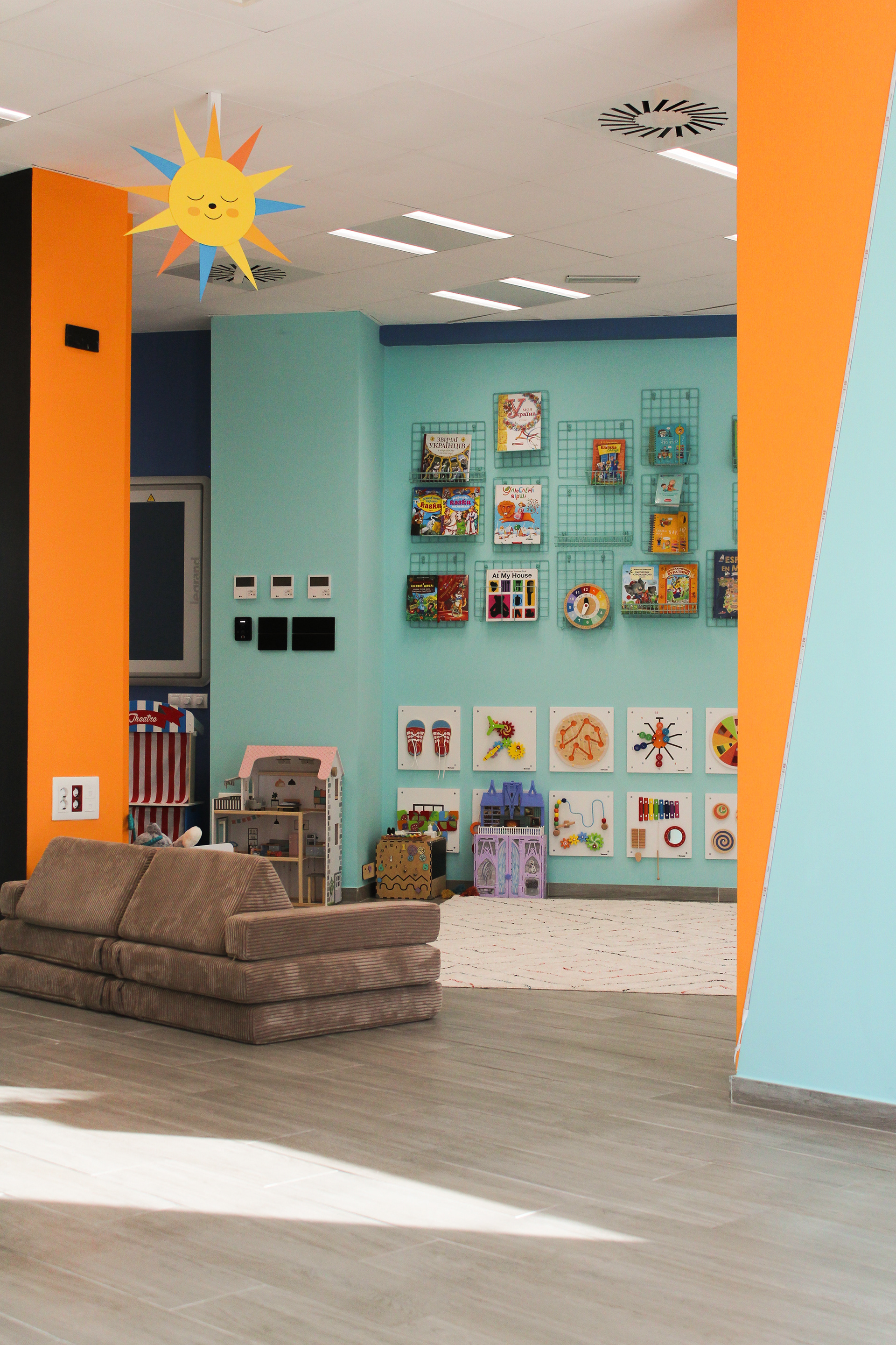
Children's space in Valencia. We started the project in July, which meant we had a fun August ahead and an opening in early October. So, we stocked up on materials, discussions, and understanding where and what we were purchasing back in July. September was filled with furniture deliveries. By early October, we were ready for the opening.
We divided the space into 4 zones:
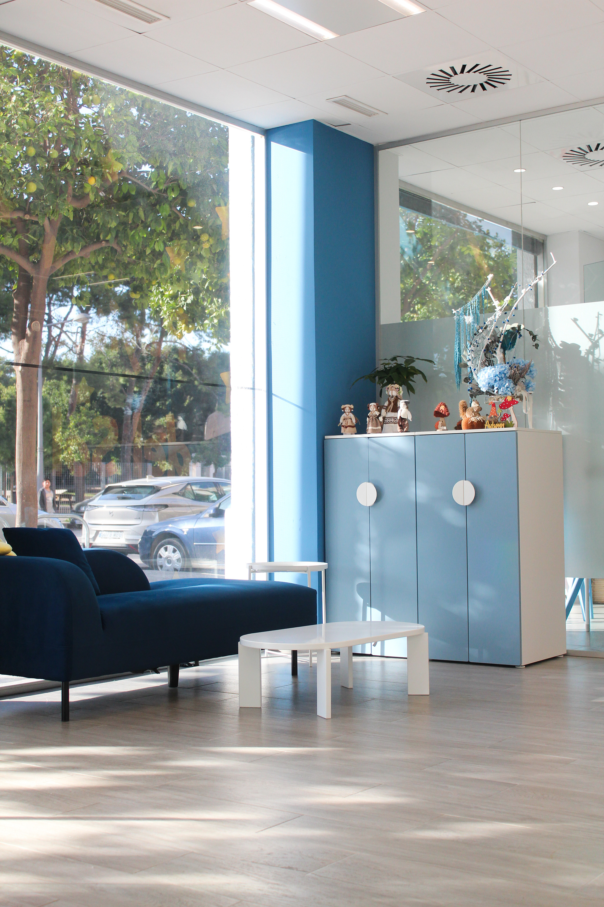
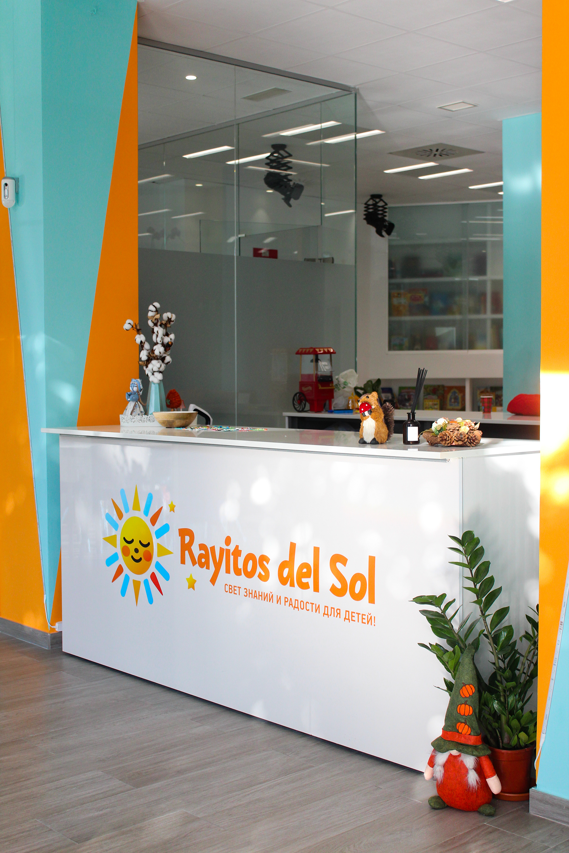
1. Reception area (or welcome zone) with a small sofa and a place to leave clothes and shoes.
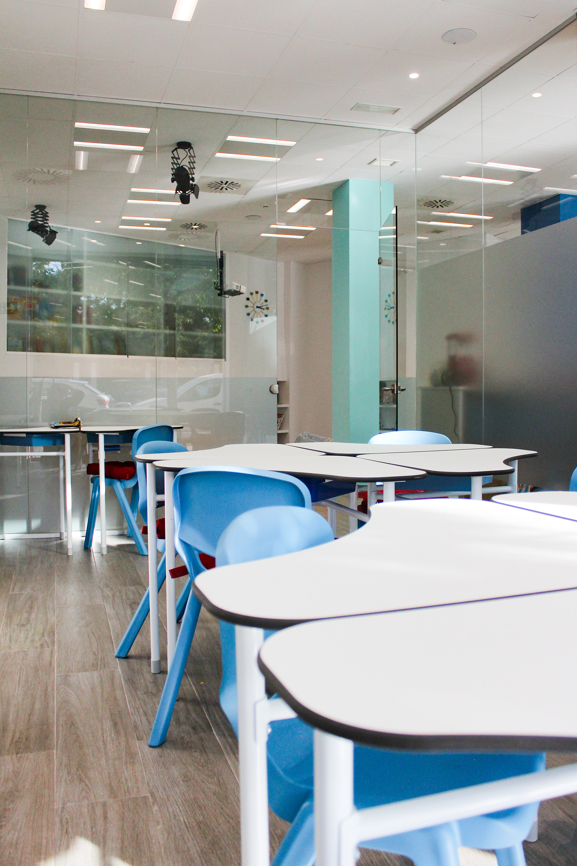
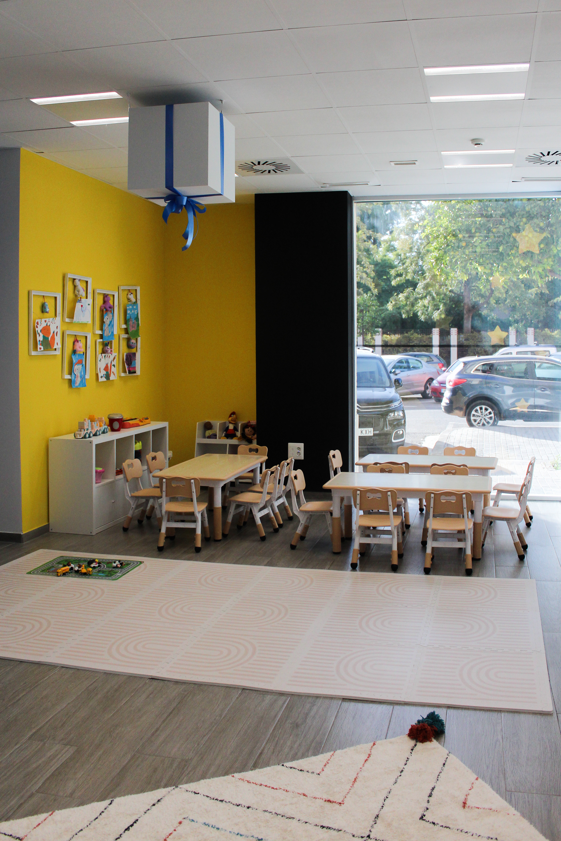
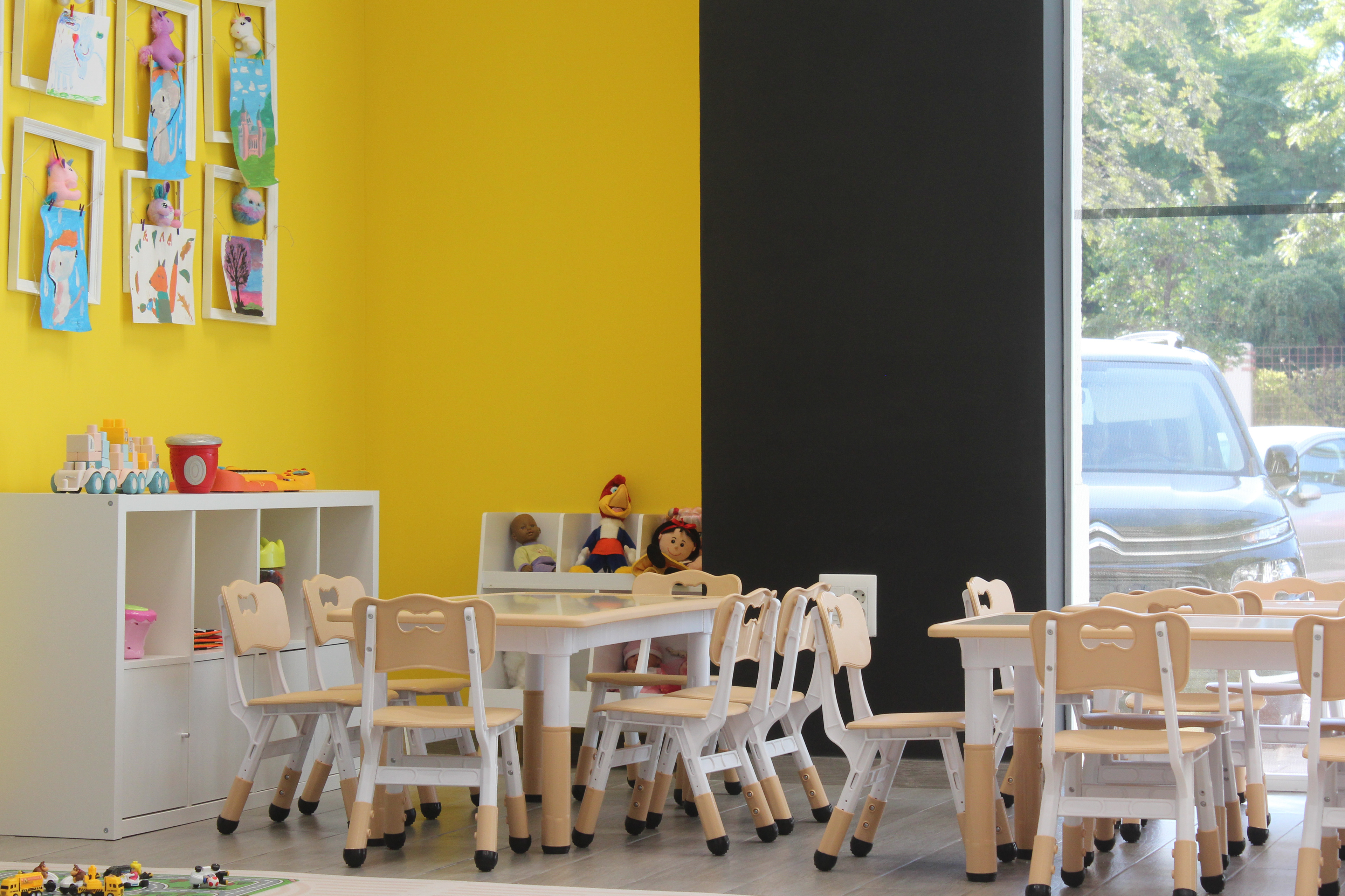
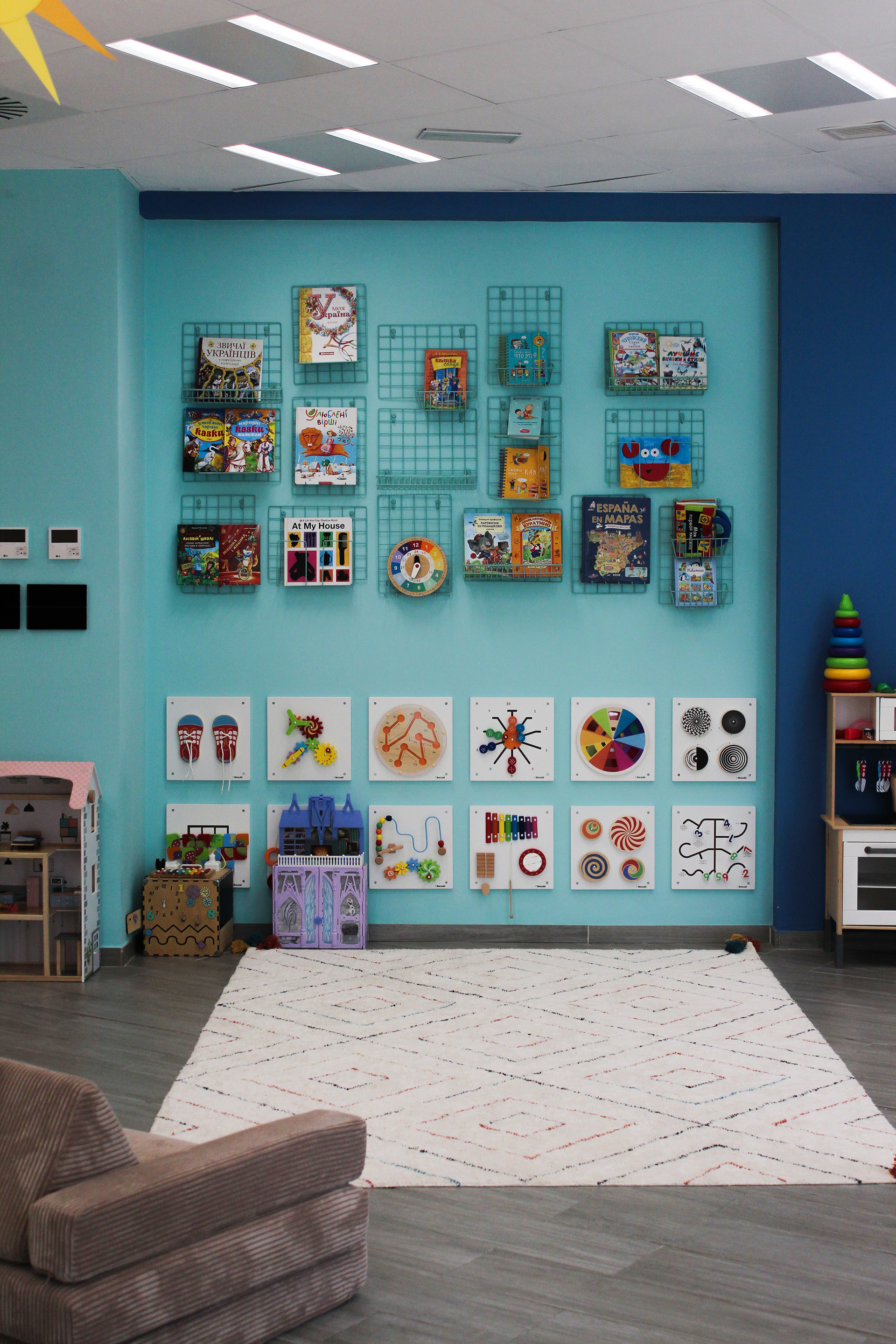
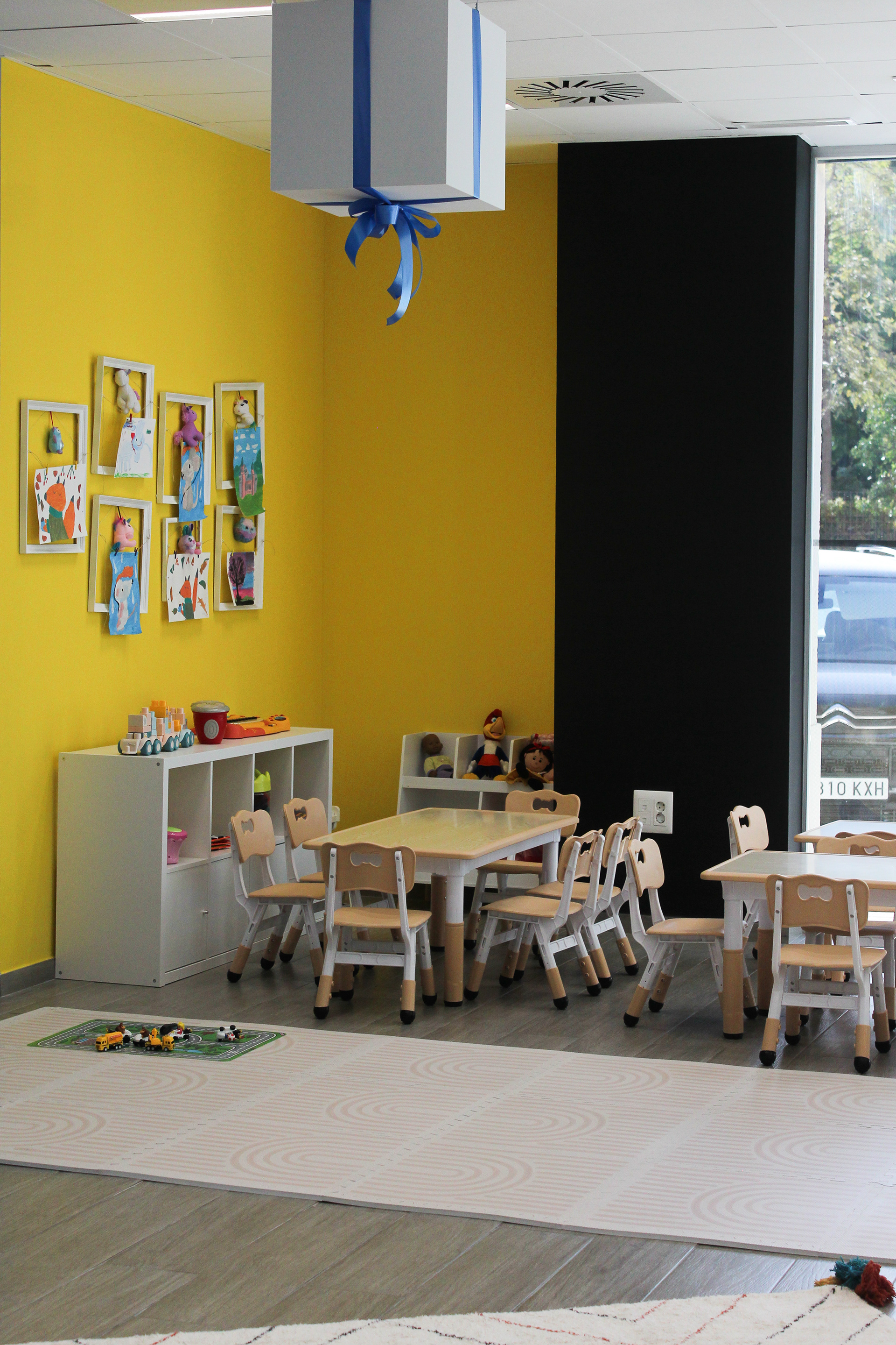
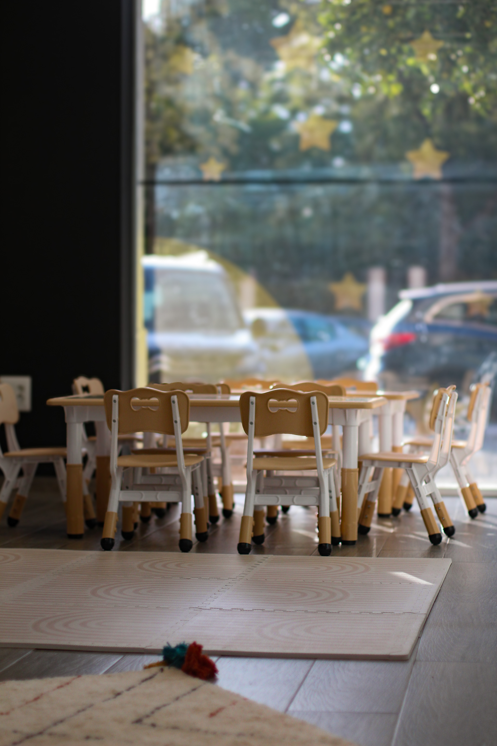
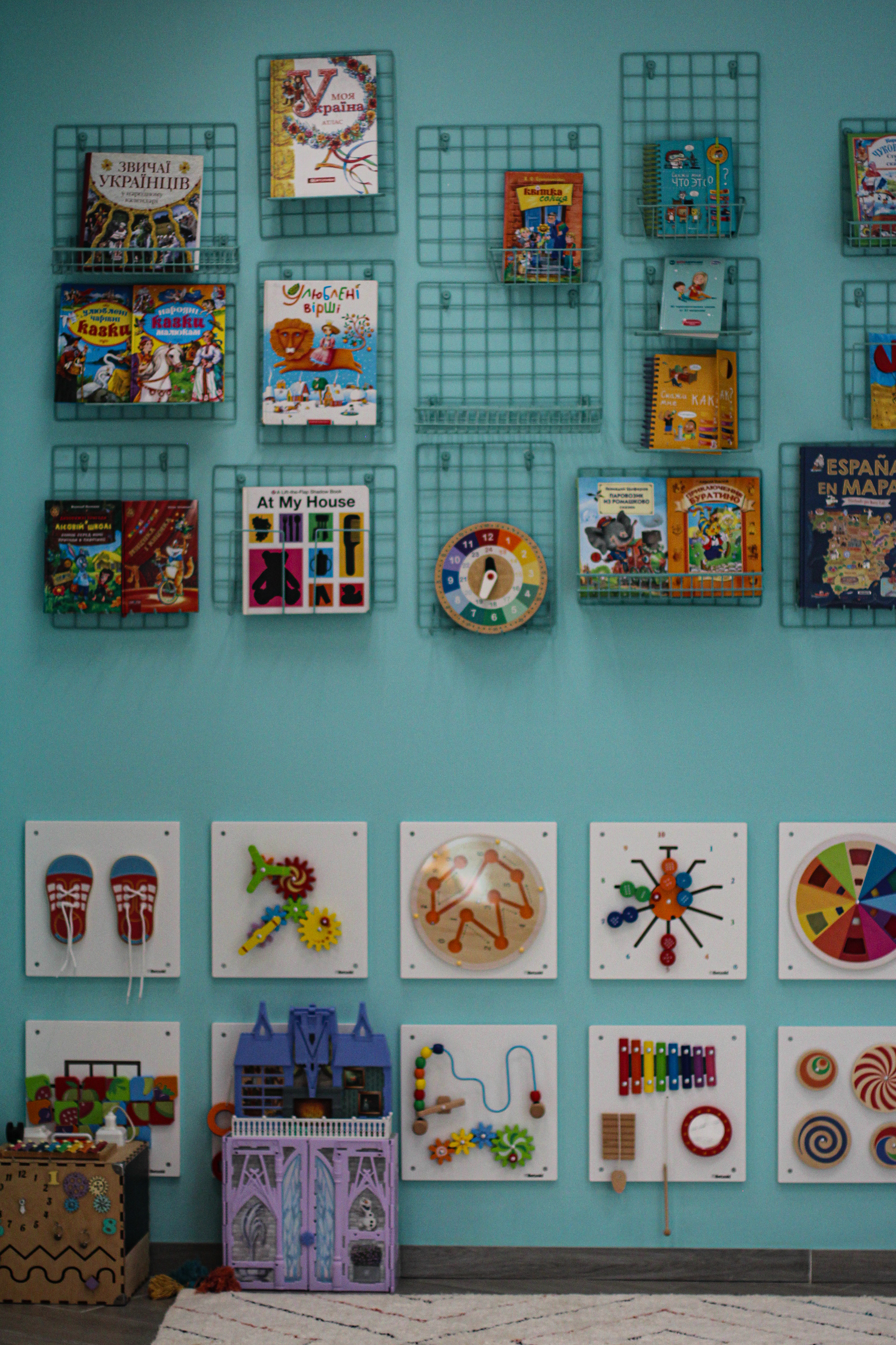
2. Kindergarten area for children up to 6 years old. There are tables for learning and developing fine motor skills (drawing, etc.). Educational toys hang on the walls (P.S. We got really into them while setting them up).
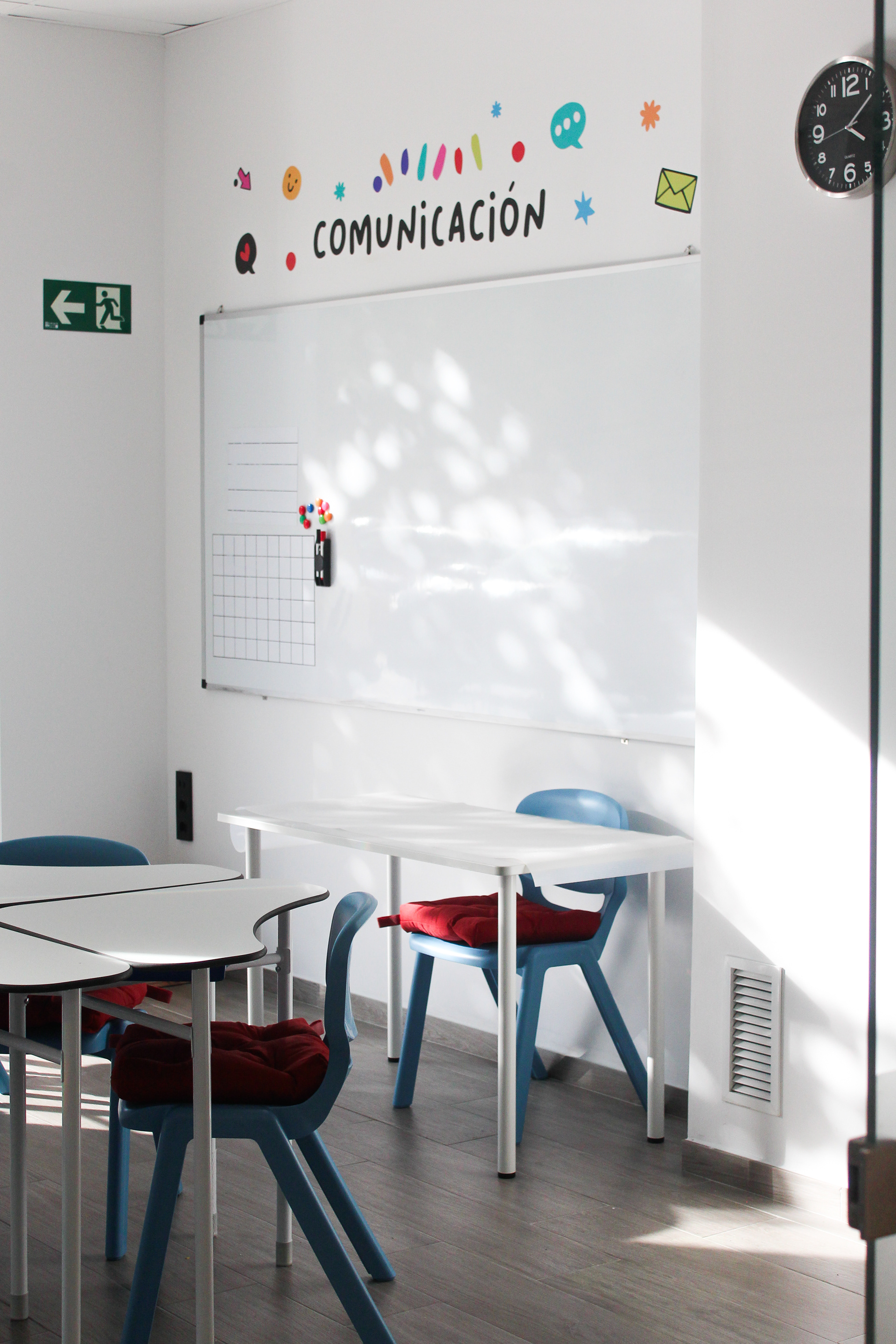
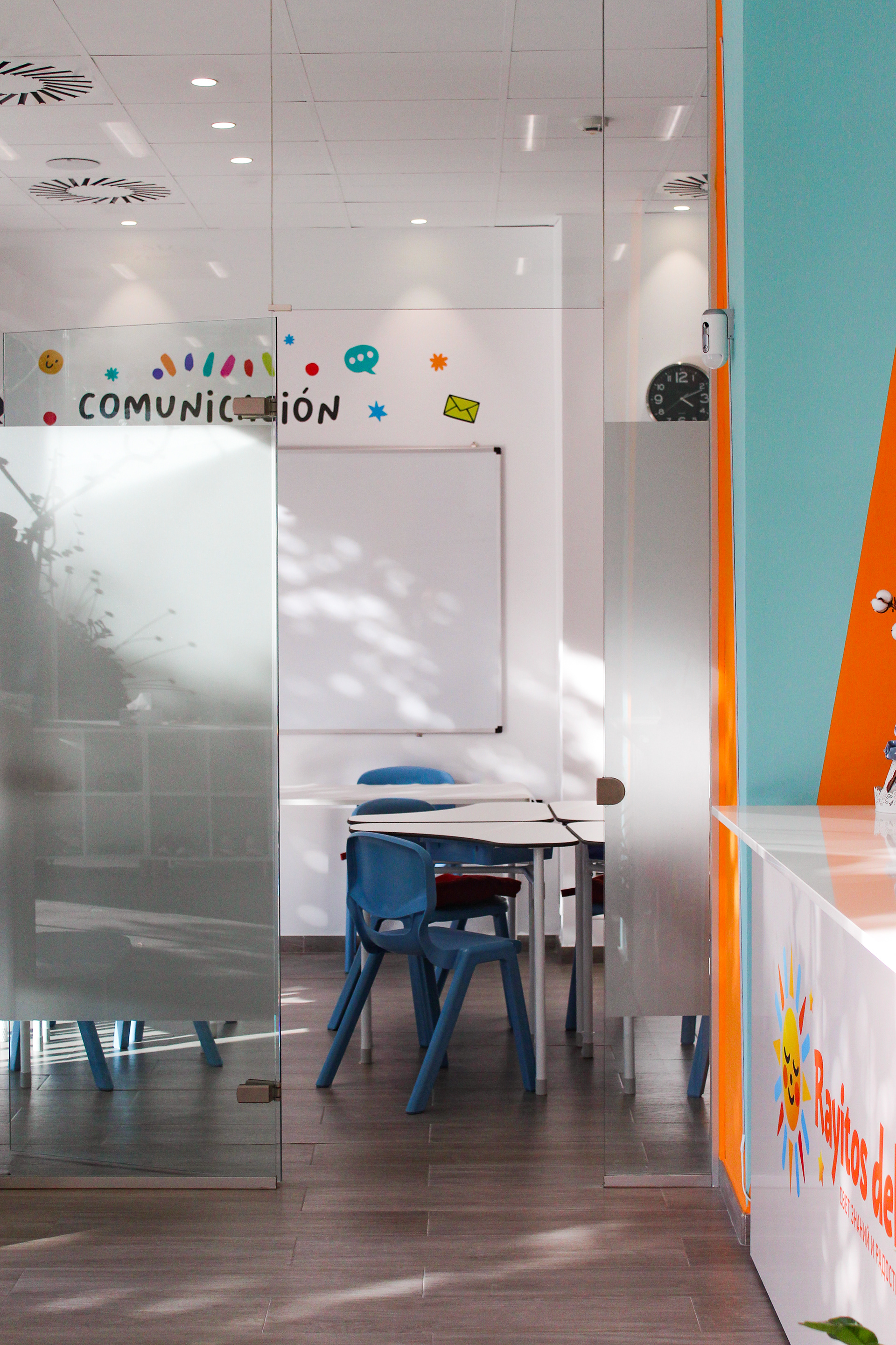
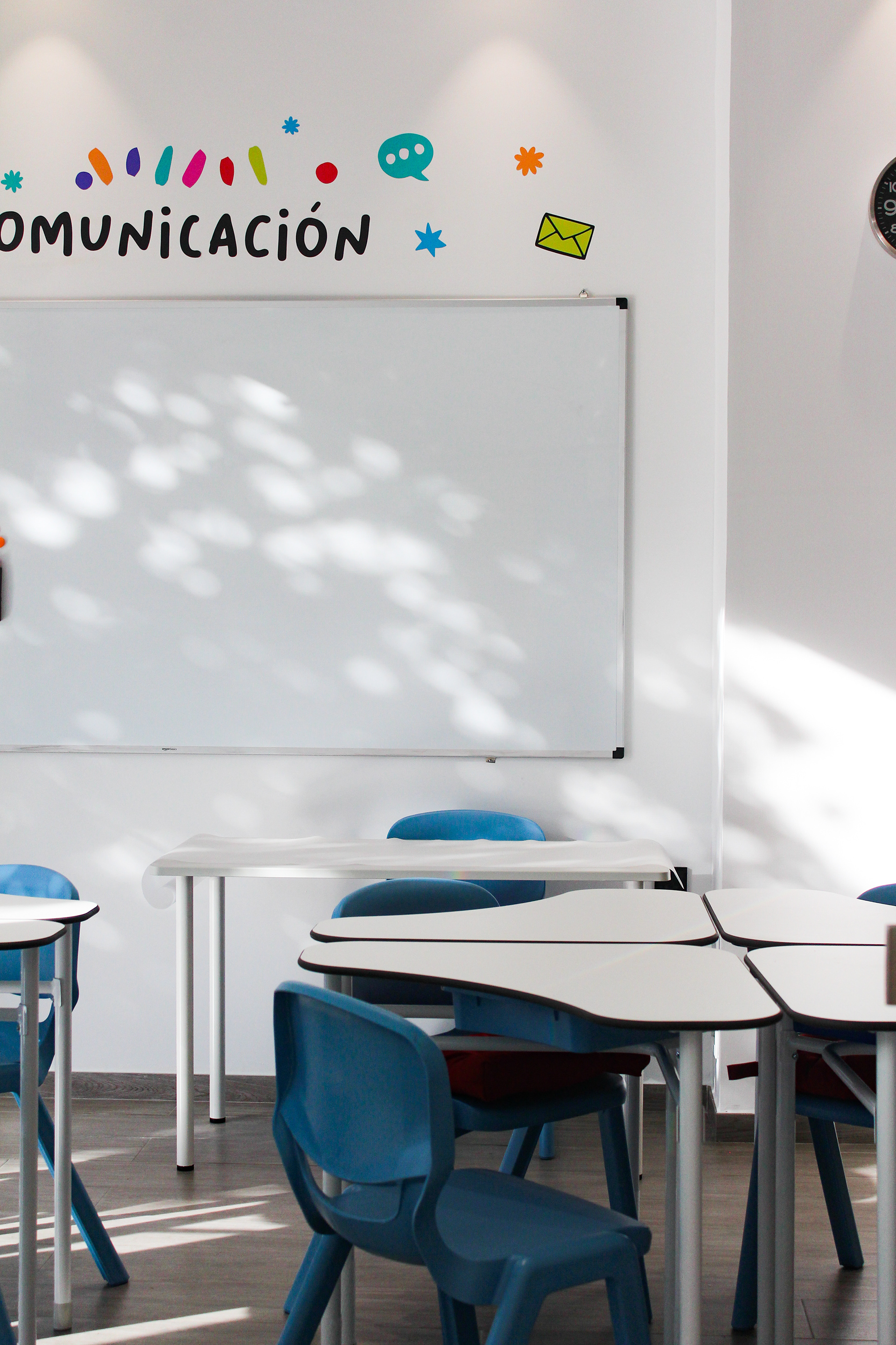
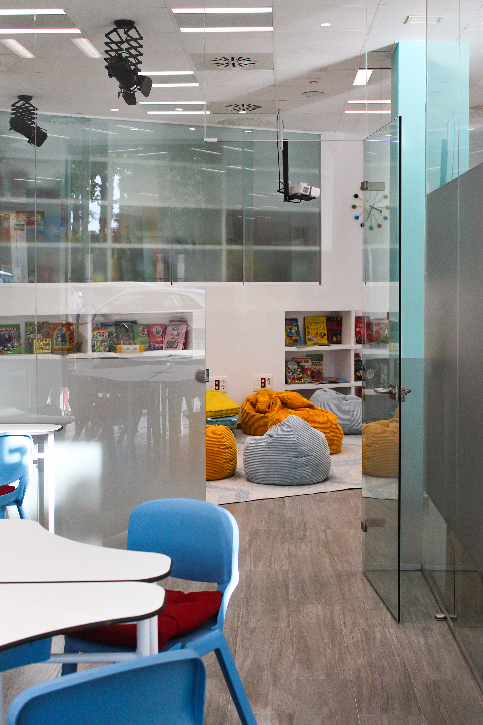
3. A full classroom with tables and a board. It is completely enclosed by a partition; this is where chess and language learning take place, among other activities. It's a zone for children and teenagers.
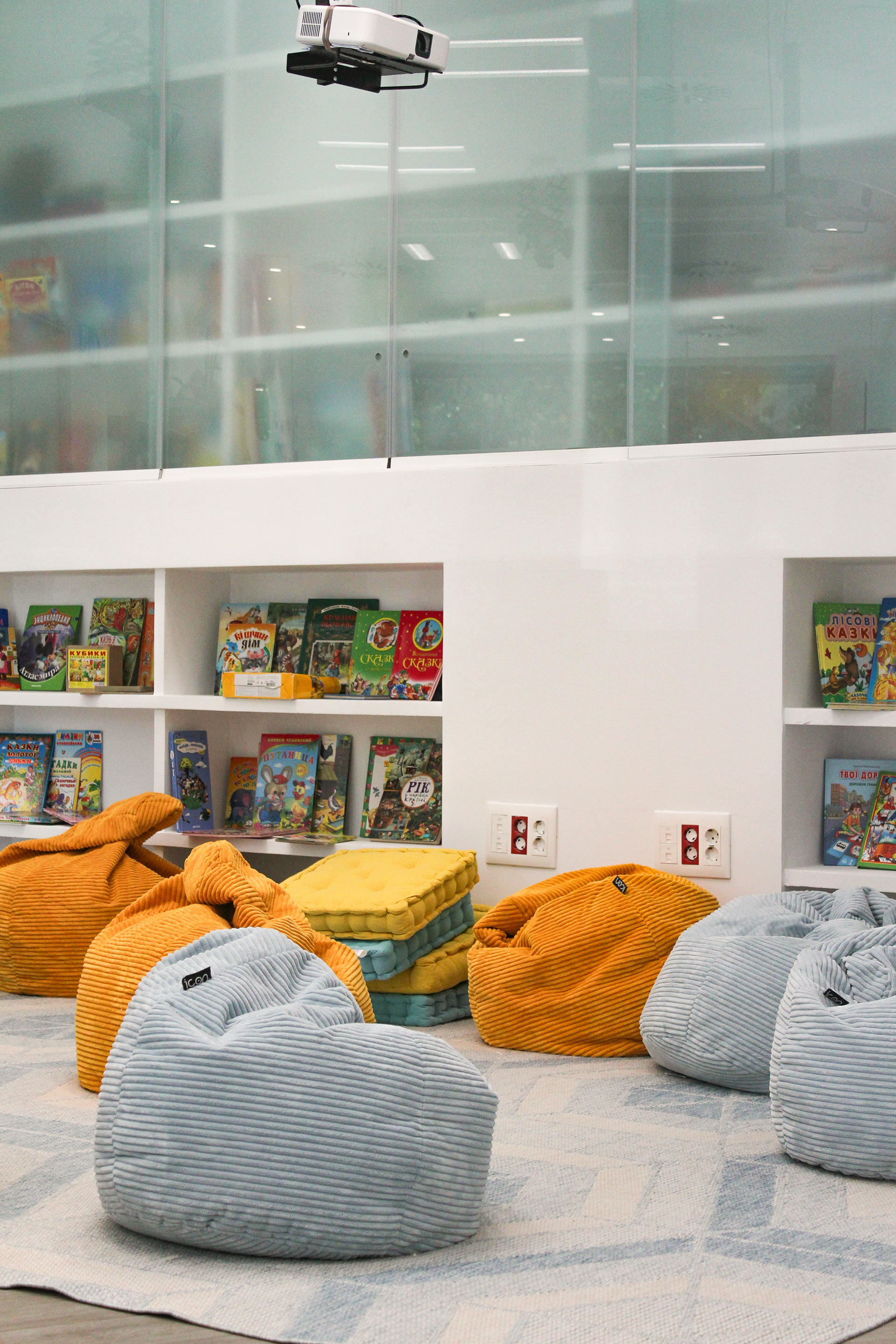
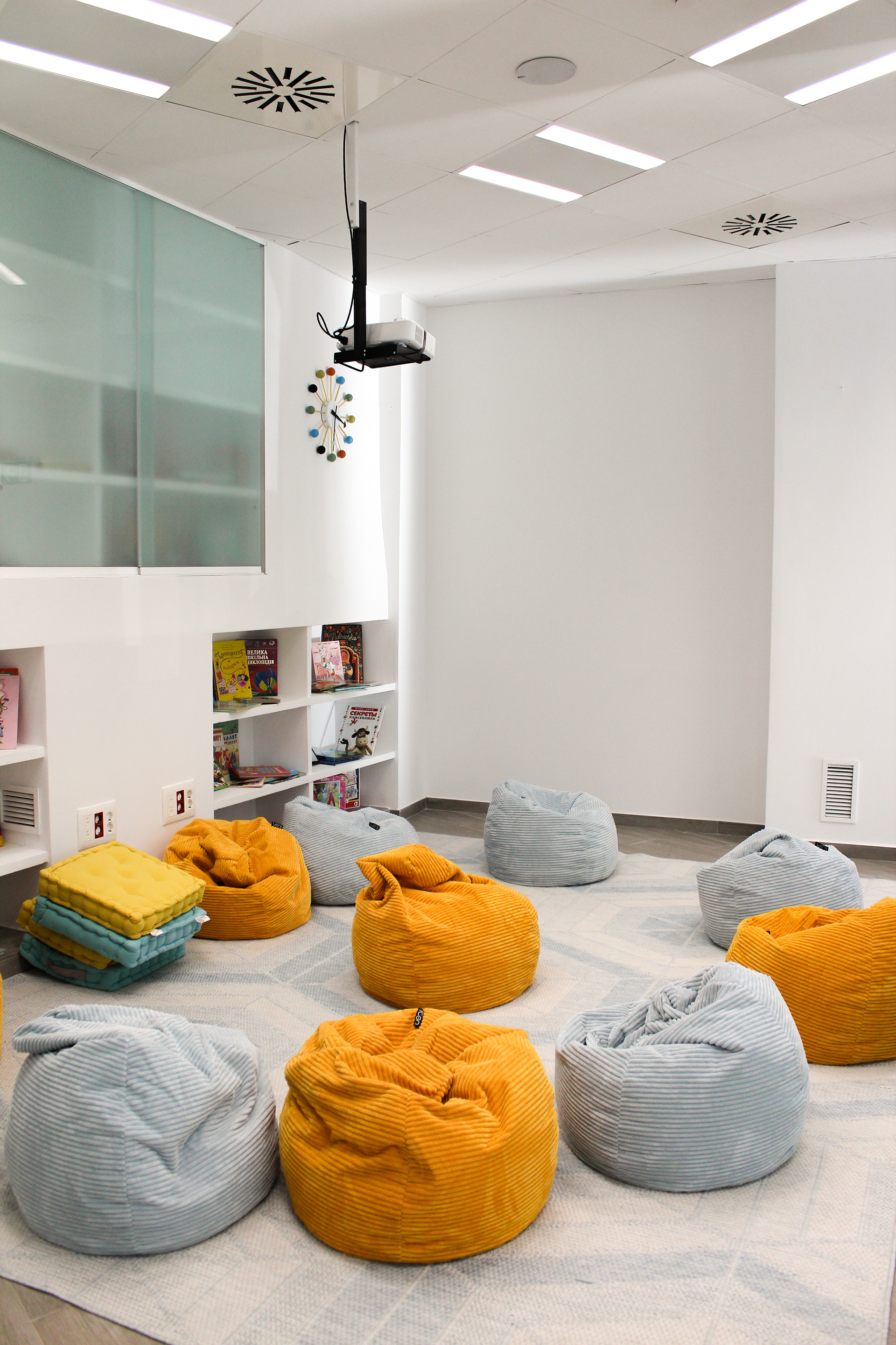
4. A cinema – something everyone loves. Entertainment and popcorn. This area has soft and very cozy poufs along with a lighting program.
1. Reception area (or welcome zone) with a small sofa and a place to leave clothes and shoes.
2. Kindergarten area for children up to 6 years old. There are tables for learning and developing fine motor skills (drawing, etc.). Educational toys hang on the walls (P.S. We got really into them while setting them up).
3. A full classroom with tables and a board. It is completely enclosed by a partition; this is where chess and language learning take place, among other activities. It's a zone for children and teenagers.
4. A cinema – something everyone loves. Entertainment and popcorn. This area has soft and very cozy poufs along with a lighting program.
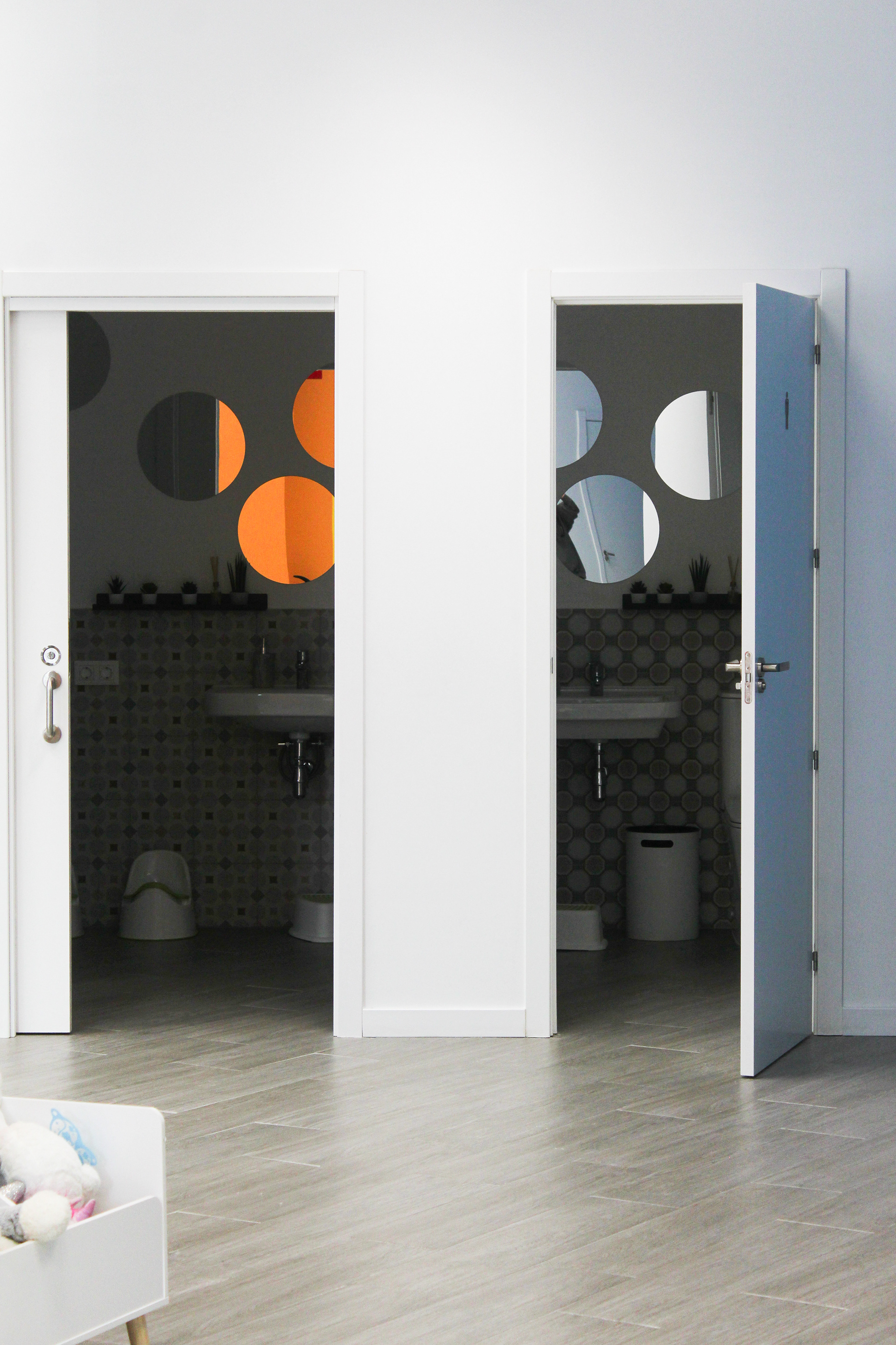
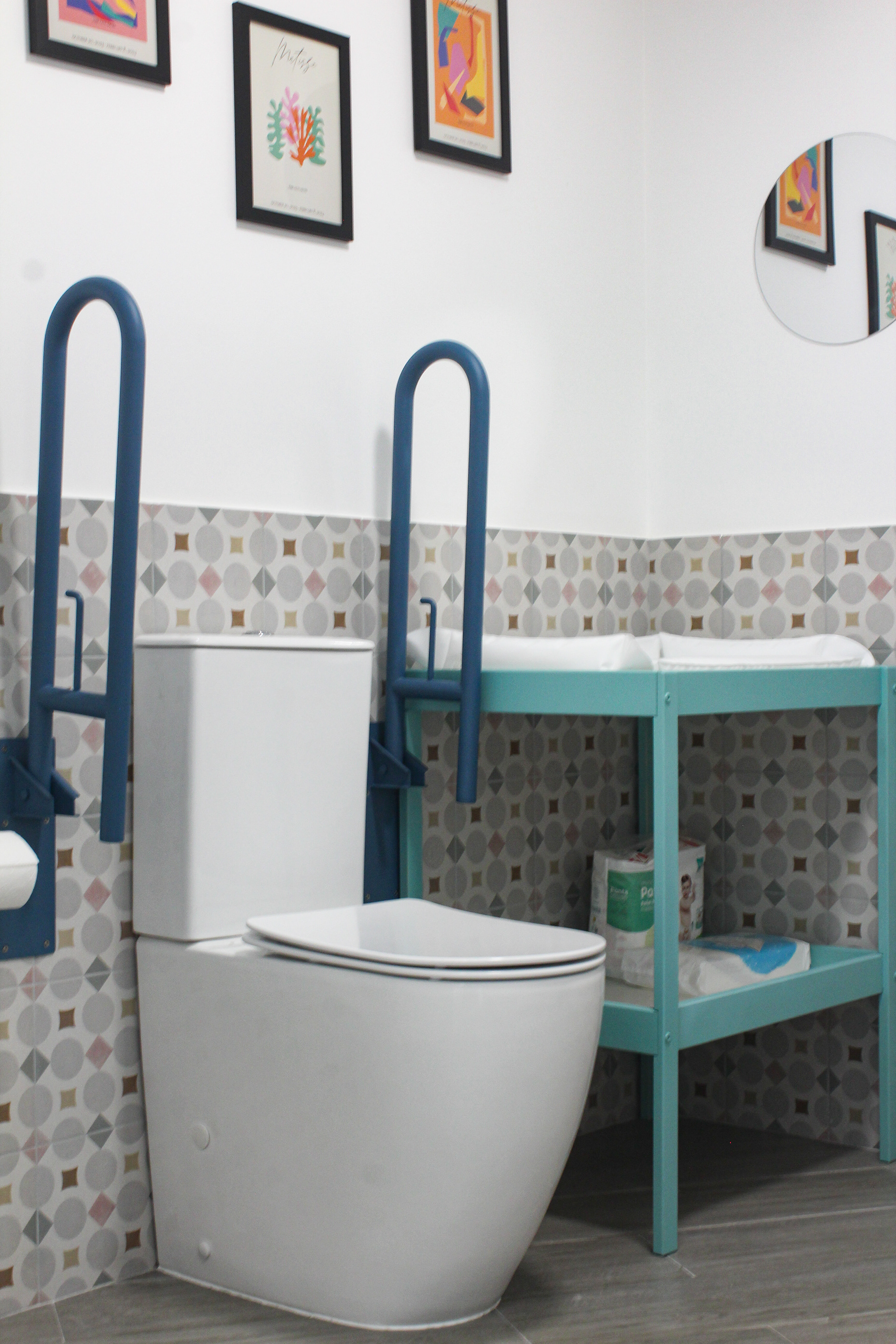
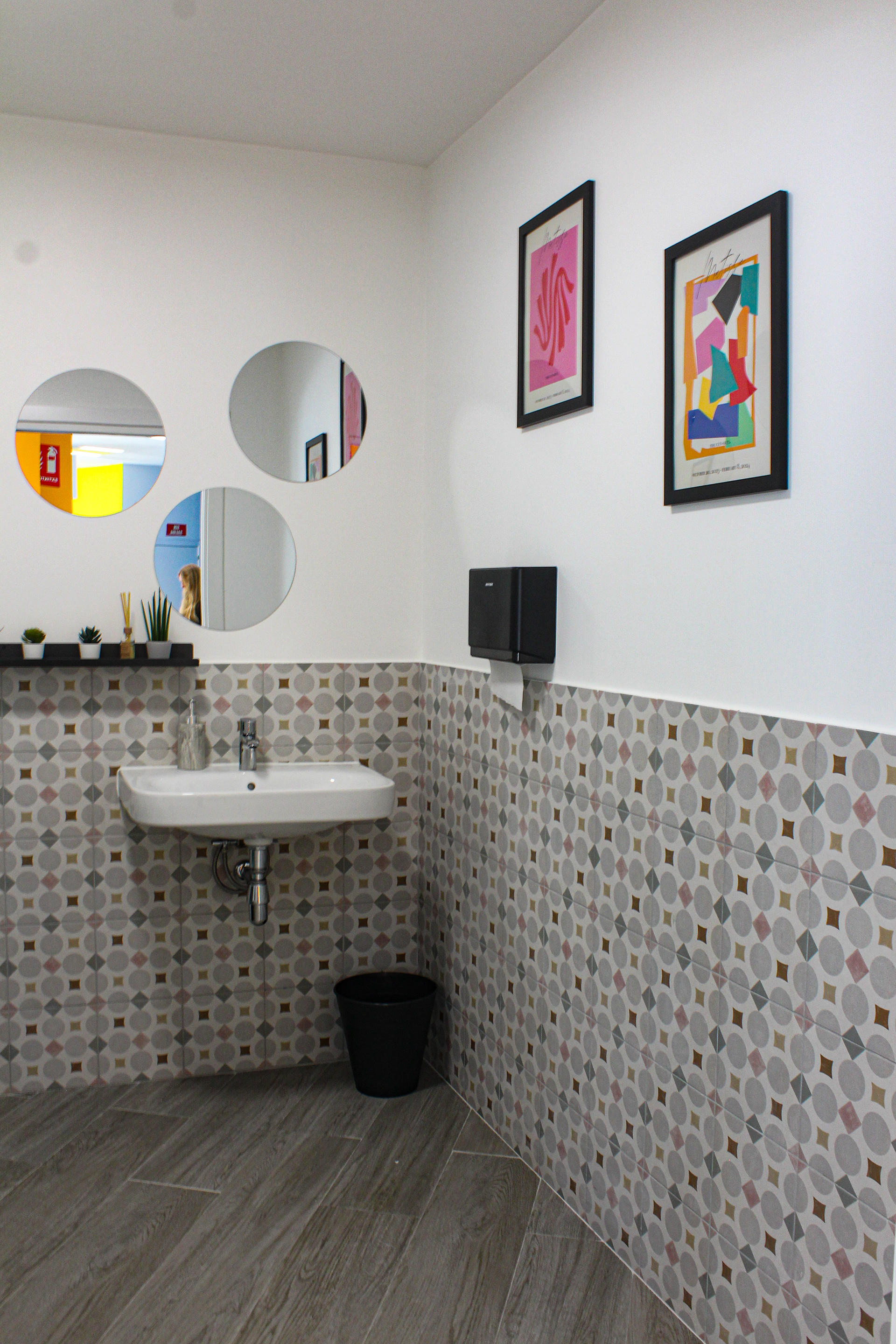
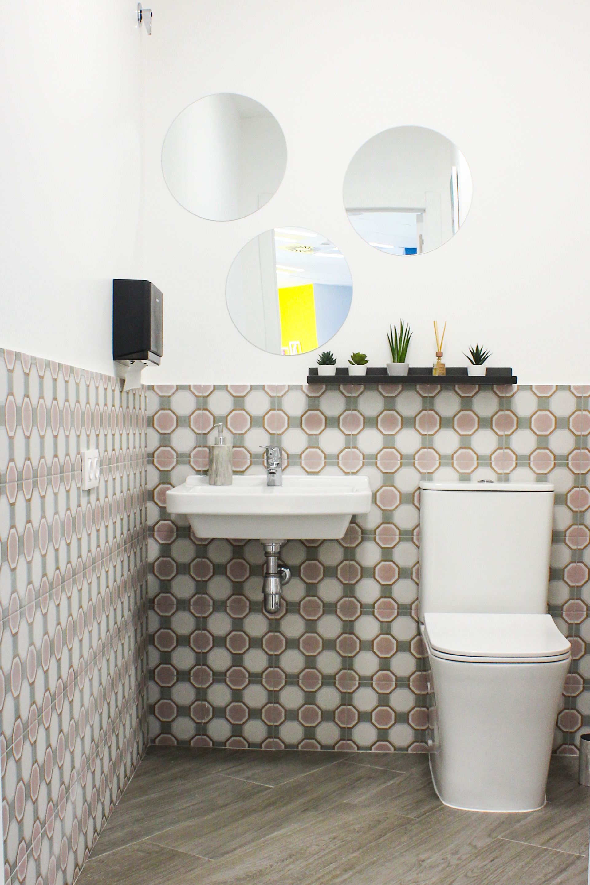
We also created 2 new restrooms, which were necessary according to regulations.
The request for the interior was: "I want color, bright and saturated." The starting point was the logo. The sun and its rays that bring joy to everyone. Yes, there are many colors in the interior! But it is very pleasing to the eye. You don’t want to leave after half an hour; on the contrary, it draws you in, and you want to spend a lot of time here. These are not the typical white interiors of Valencia; we have vibrant blue, turquoise, yellow, and orange. There is also black – it is functional, serving as walls for chalk drawing.
We specially matched some furniture to the wall colors – that’s how we ended up with turquoise shelves for books and various thematic displays. Plus, there’s a stretch between the columns for any decor. There were birds (which we crafted by hand for the opening), then Halloween, and now – New Year.
We specially matched some furniture to the wall colors – that’s how we ended up with turquoise shelves for books and various thematic displays. Plus, there’s a stretch between the columns for any decor. There were birds (which we crafted by hand for the opening), then Halloween, and now – New Year.
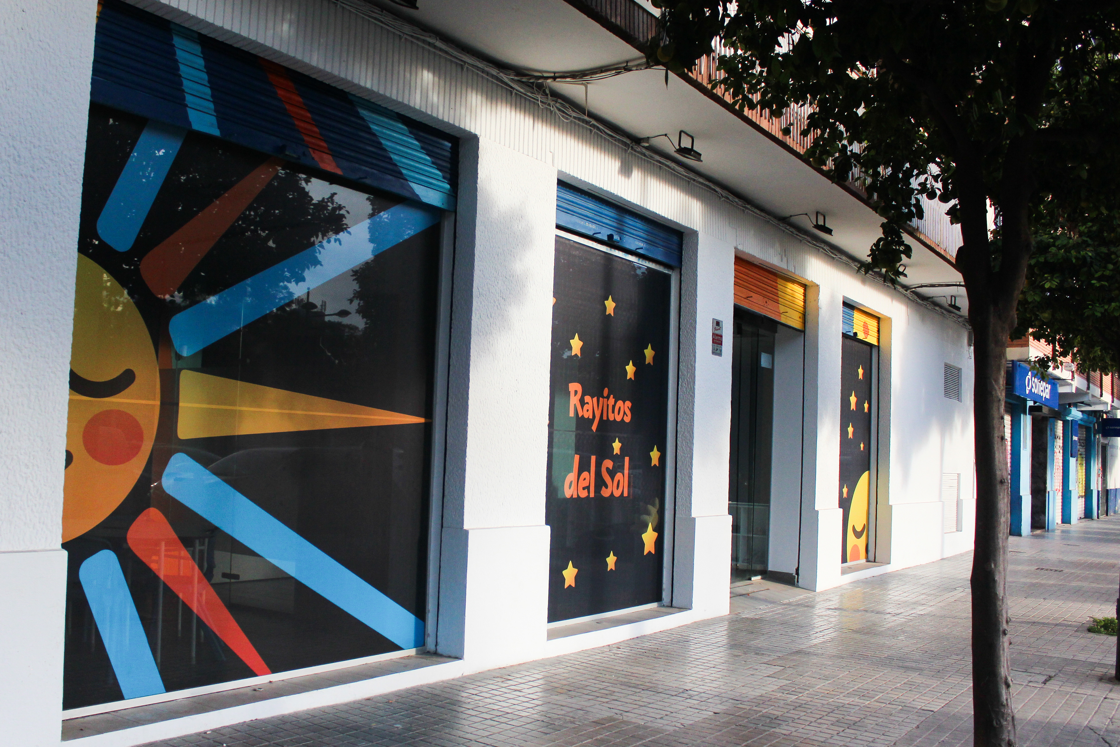
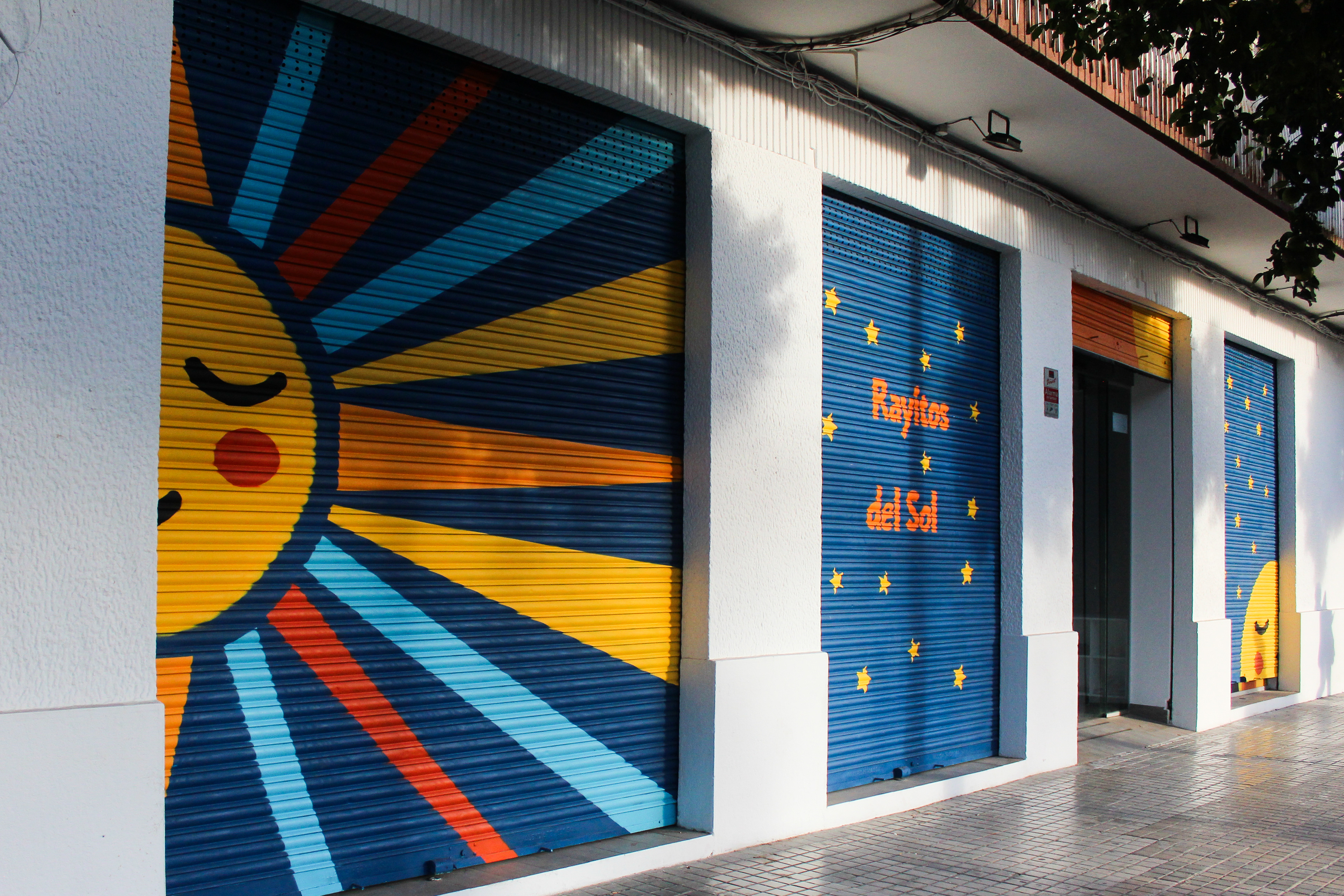
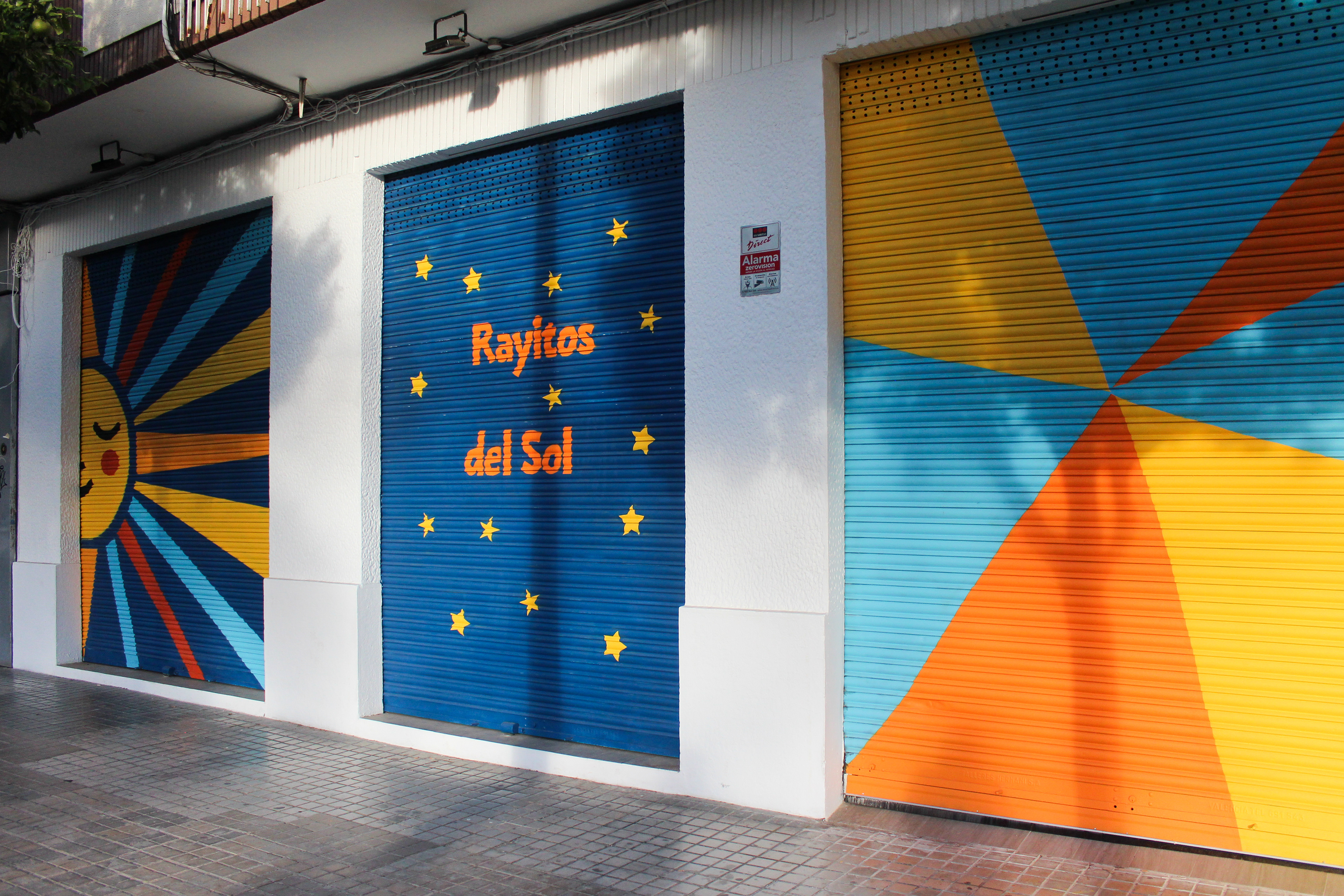
Facade area. The space needs to be appealing not only from the inside but also from the outside. The idea was to paint the metal roller shutters with a recycled logo. I created the concept, and it was executed in a graffiti style. Now the space is always visible, and people constantly ask what it is and what it’s for. In fact, during the process, hundreds of people approached us . The second point was to create light and visual protection for the space, considering there are children, but also with an advertising aspect. We chose perforated film for the windows, allowing light to enter but completely blocking the view inside. Now you can only see the reception area through the entrance doors, and that’s it . It turned out to be a win-win.